So in this project we have a number of objectives to meet.
In groups we have to design our own brand online news channel which consists of our own original title sequence, GFX and strapline.
Now with the online channel I had a few ideas of what to do and expect from a new channel;
This is the BBC news channel, when I look at a news channel I see a number of things before you see the artistic.
First is the brand, which is the BBC logo band at the top of the news page. This is the identifier for the channel.
For our page I want a similar stand out band which will catch the eye of readers to let know know what channel their on.
The next thing is the lay out of the site, as their are government funded they don't need to place advertisements to fund the page. They have laid out the page with a categories bar at the top, so the viewers can select a certain type of news. Then they start with the big head line with a big picture at the top of the channel. Then it gets smaller as you go down the page as the stories get less important.
I like the set out of the BBC page as they grab the views attention with a big head line and big picture of the most important news. This grabs the viewer and makes them want to know more about the story.
With the head line they use simple yet powerful words, followed but a powerful picture.
"RAF set for strikes on IS targets" Short but effective, with powerful words like RAF, strikes, targets. All these words grab the attention of the viewer to read on.
I want this kind of thing on our page, to make the page stand out and look interesting and grab the attention on the viewers.
.JPG)
With the Sky news channel it's a little different than the BBC channel. They still have their brand logo at the top clearly stating which channel it is, but it's not at the top, instead there's an advert. Now this is for funding purposes as their not government funded. With this the channel is covered in adverts. However they still have their big head line and picture as their first story, to grab the attention of the viewers.
The next aspect of the channel is a brand logo, with the logo it's first important not to copy any big logo's already out where.

With all these different brands you can clearly tell them apart by one thing, which is the colour. The colour is a big thing which helps people identify the channel.
The other thing for a good logo is design, each logo has a unique design which identifies them. With channel 4 they have the big purple 4 and the BBC have the letters in tiles all these help identify the channels. With our channel we need the same aspects to stand out, we need a good colour and design which give us our individuality and identity which viewers will recognise.
The next thing is a original title sequence; this is the sequence which appears before the news programme comes on.
These are good sequences because they show the brand logo which help people identify the channel. The music is a good aspect of the sequence as it helps the audience distinguish the programme they are watching as it's catchy and easy to recognise. Also the music is quite serious and formal which helps the theme of the programme. I want our title sequence to have these qualities so our viewers will recognise not only our news channel but they know just from the style and music that it's a news programme.
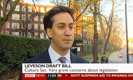
Another feature of a news report is a strapline. This appears when interviewing someone, the strapline will appear across the bottom of the screen and will contain; the interviewers name and what they do and the subject title. Also accompanied by the news brand logo and colours. In our channel I would like to have something similar to the BBC strapline as I like the lay out of it.
 2: The other idea I had was to keep it in the world war 1 era and have a soldier just walking back to base when he randomly gets shot from a surprise attack. From hitting the group he gets carried to the hospital all the way passing in and out of consciousness, before at the hospital bed having death take him.


.JPG)